
The Location Performance Comparison lane gives you the chance to compare your branches’ performance against each other. The basic concept is really the same as the Category Performance Comparison lane, just looking through more of a ‘macro’ sort of lens.

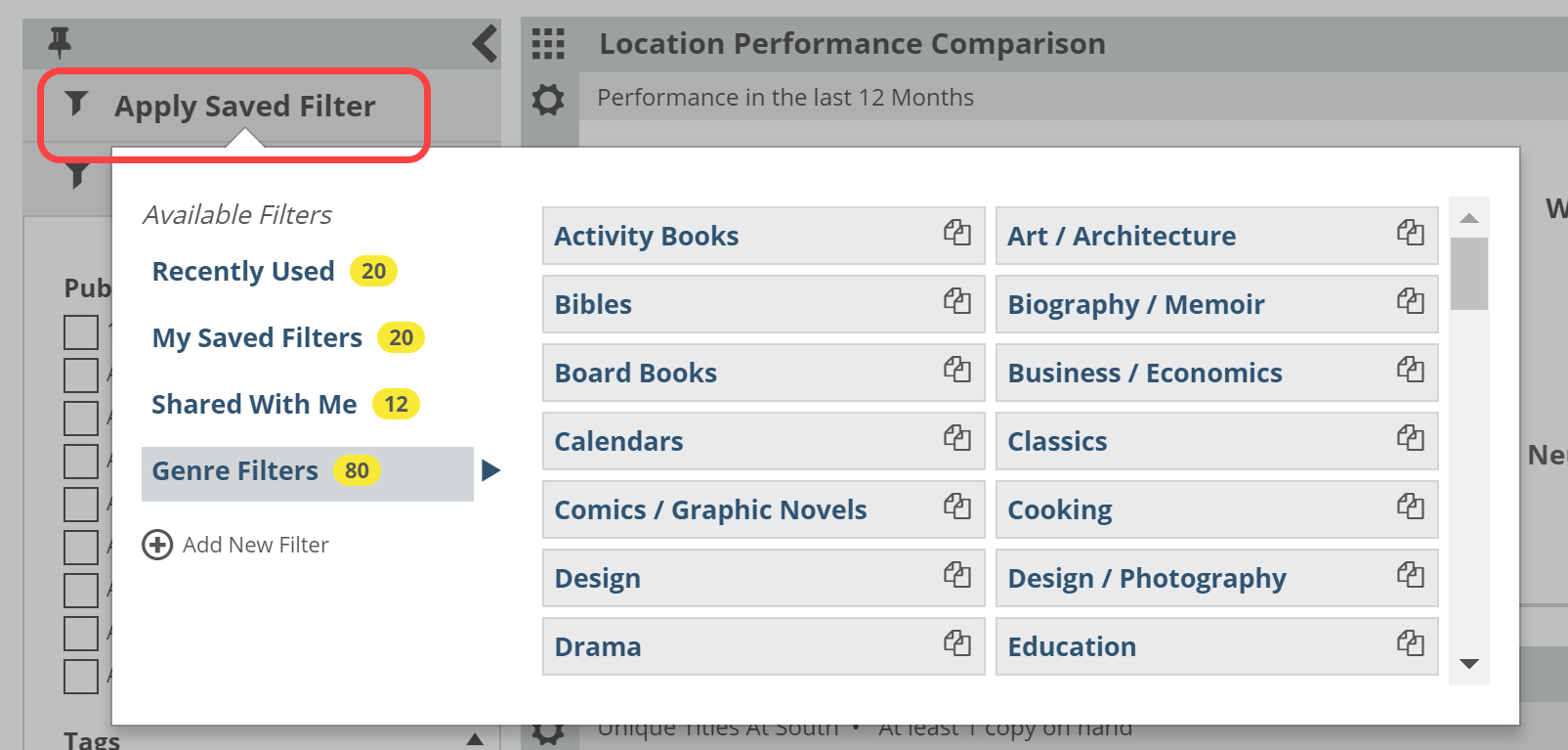
The most likely scenario here is to use a Saved Filter to compare different portions of your collection in your different branches. For example, which branch has the best turns for kids books?
You can create filters using your own Collection Codes as well as a wide range of options for combined filters (Example: kids science board books published by HarperCollins between 2011 and 2013).
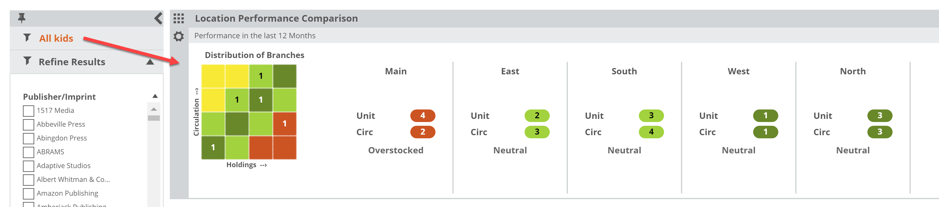
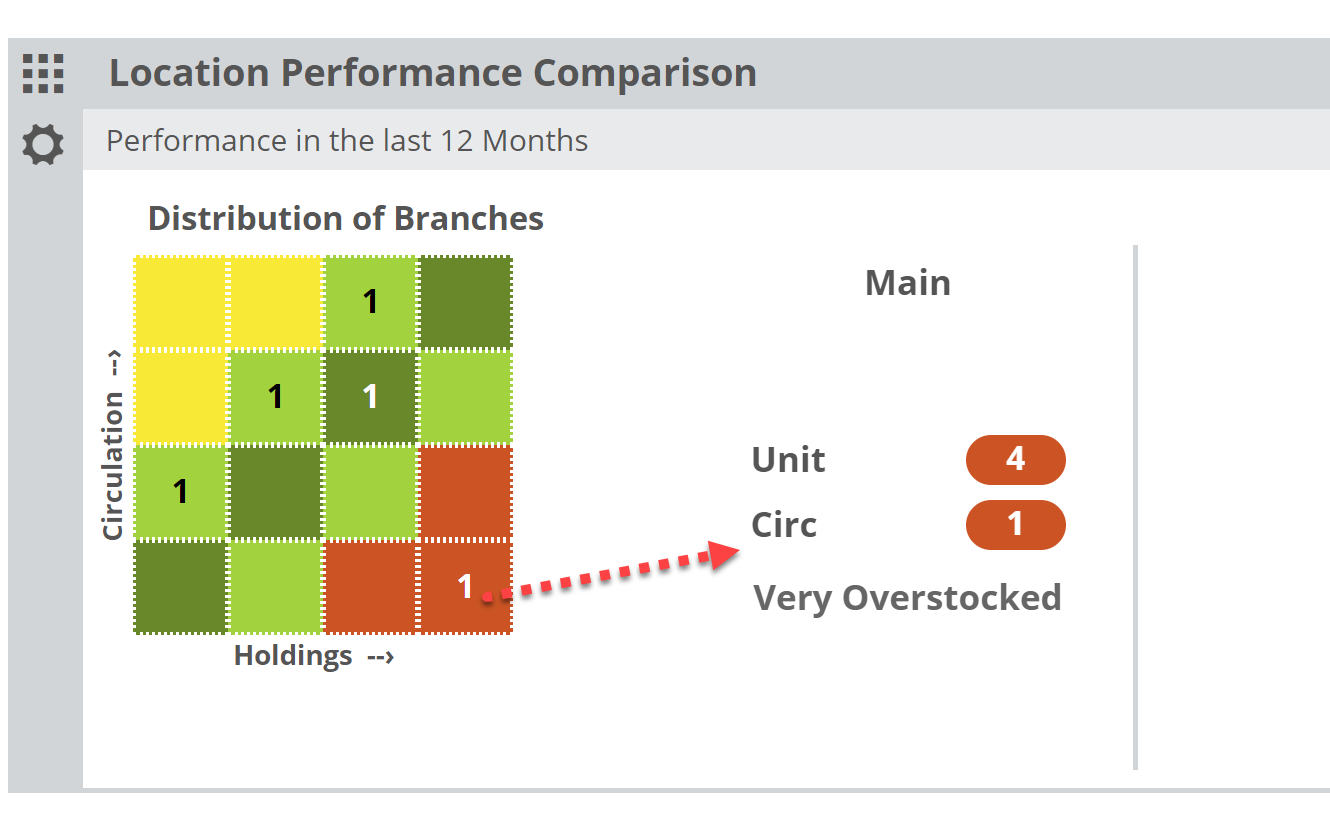
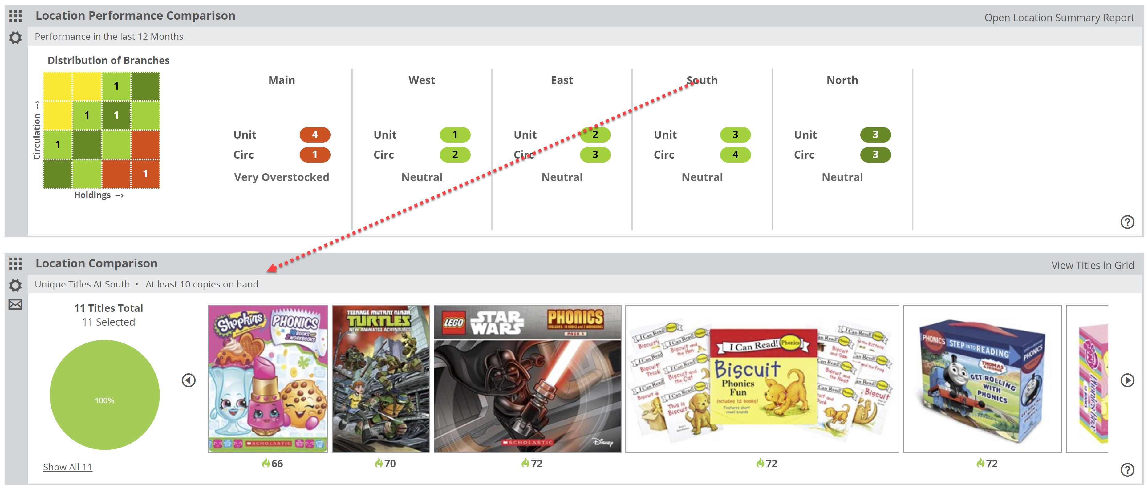
In the graph, each branch is represented within one of the quadrants. If more than one branch land in the same quadrant, you’ll see a 2. This simply indicates the number of branches that qualify for that quadrant based on their holdings and turn levels. Keep in mind that placement here is relative, so each branch is measured and placed according to their own results in comparison with the other branches’ results, rather than compared to an arbitrary “ideal.”
The horizontal axis represents holdings in total number of units (copies) owned. The larger the holding, the farther to the right a branch will show.
The vertical axis represents “Circulation.” The higher the Circulation number, the higher on the grid that branch will land. A branch in the upper right, dark green quadrant would be one that is larger than the other branches with the highest circulation. A branch in the lower left would be relatively smaller than your other branches with the lowest circulation.
You can click on number to see which branches land in that quadrant:
Or you can view all your branches without clicking through (especially if you only have a few locations).
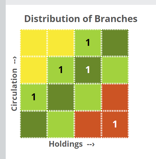
The color-coding is consistent between the graph and its details. Within those details, the numbers shown under each branch indicate where on the ‘heatmap’ graph this branch lands. If it helps, you can think of it like the board game “Battleship.” Under “Main” you can see that the Unit number is 4, indicating it lands in the 4th column over, and the Circ number is 1, indicating that it landed in 1st row up. This is more to convey a visual representation of the relative size and performance of each branch. To see more specific details, click Open Location Summary Report in the upper right corner of this lane:
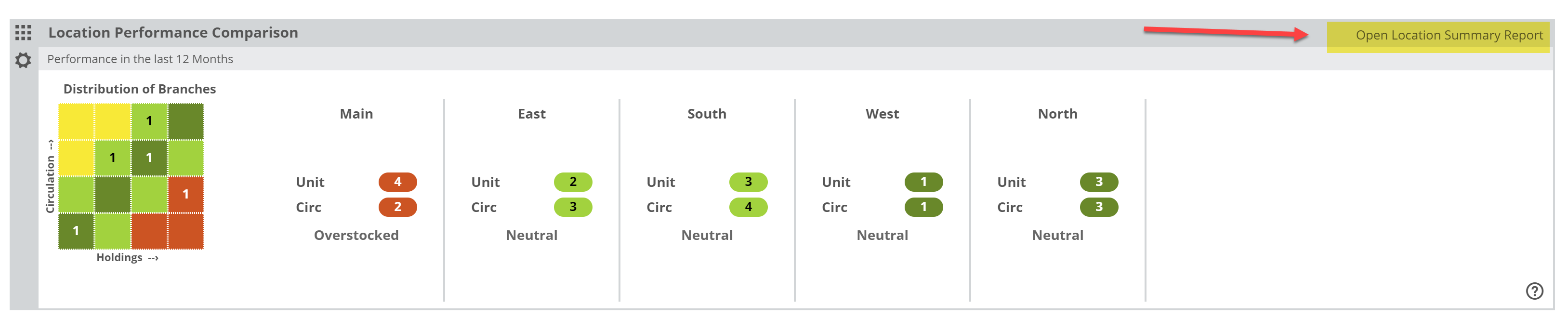
There, you’ll see the numbers that prompted the placement of these branches on the graph.

Using this information, it can be clear which branches could use an influx of books, and which could stand to lose a few. This can greatly aid in the maintenance of a floating collection, or at the very least, in helping maintain a logical balance of your holdings at your multiple branches.
Helpfully, you can click on a branch within the graph’s details, which will update the comparison branch in your Location Comparison lane. This facilitates the discovery of likely transferable titles.
Location Performance Comparison, Setting Your Parameters
Your very useful Saved Filters allow you to zoom in to portions of your collection, as broad or as narrow as you like. These filters will be quite useful in helping you get the most out of the Location Performance Comparison tool. You can have as many Saved Filters as you like, and can quickly jump between them, edit their attributes, etc.
Beyond those filter options, you can set a time frame for this lane:
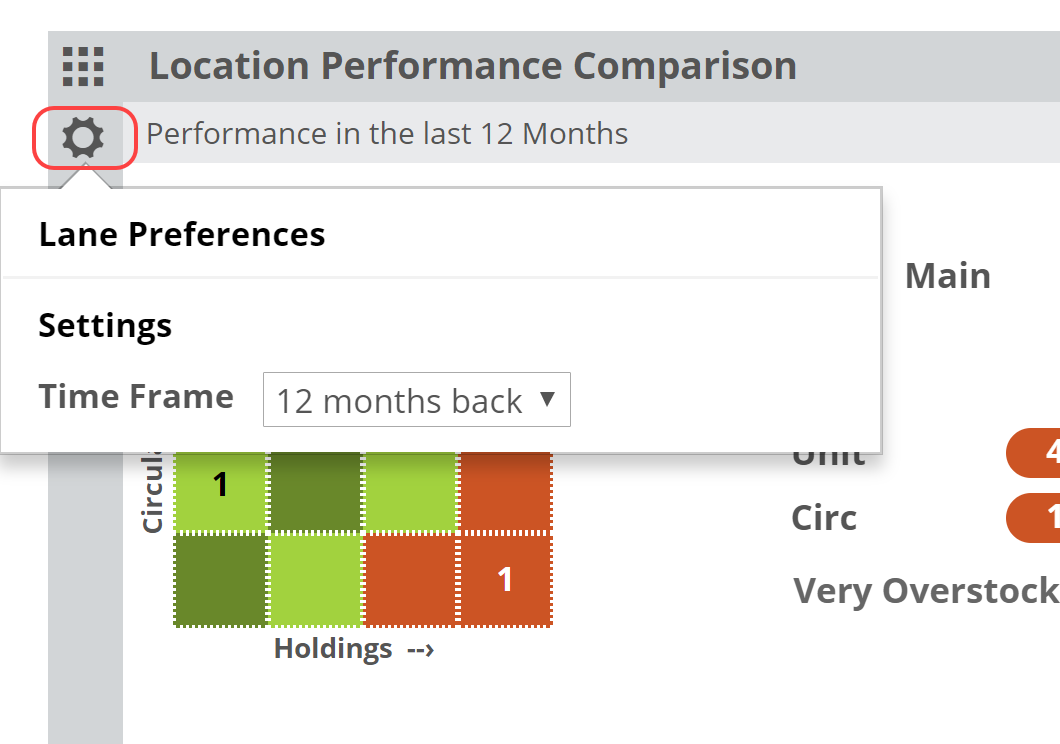
Your selected time frame will update circulation numbers based on that selection. 12 months vs. 1 month will clearly show different numbers. Keep in mind that it can be quite helpful to measure, say, Summer or Holiday Season circulation and turns. You can dive in to the Detail report to see more precise numbers.
Location Performance Comparison, Reading the Graph
The Location Performance Comparison lane gives you the chance to compare your branches’ performance against each other. The basic concept is really the same as the Category Performance Comparison lane, just looking through more of a ‘macro’ sort of lens.
The most likely scenario here is to use a Saved Filter to compare different portions of your collection in your different branches. For example, which branch has the best turns for kids books?
You can create filters using your own Collection Codes as well as a wide range of options for combined filters (Example: kids science board books published by HarperCollins between 2011 and 2013).
In the graph, each branch is represented within one of the quadrants. If more than one branch land in the same quadrant, you’ll see a 2. This simply indicates the number of branches that qualify for that quadrant based on their holdings and turn levels. Keep in mind that placement here is relative, so each branch is measured and placed according to their own results in comparison with the other branches’ results, rather than compared to an arbitrary “ideal.”
The horizontal axis represents holdings in total number of copies owned. The larger the holding, the farther to the right a branch will show.
The vertical axis represents “Circulation.” The higher the Circulation number, the higher on the grid that branch will land. A branch in the upper right, dark green quadrant would be one that is larger than the other branches with the highest circulation. A branch in the lower left would be relatively smaller than your other branches with the lowest circulation.
You can click on number to see which branches land in that quadrant:
Or you can view all your branches without clicking through (especially if you only have a few locations).
The color-coding is consistent between the graph and its details. Within those details, the numbers shown under each branch indicate where on the ‘heatmap’ graph this branch lands. Under “Main” you can see that the Unit number is 4, indicating it lands in the 4th column over, and the Circ number is 1, indicating that it landed in 1st row up. This is more to convey a visual representation of the relative size and performance of each branch. To see more specific details, click Open Location Summary Report in the upper right corner of this lane:
There, you’ll see the numbers that prompted the placement of these branches on the graph.
Using this information, it can be clear which branches could use an influx of books, and which could stand to lose a few. This can greatly aid in the maintenance of a floating collection, or at the very least, in helping maintain a logical balance of your holdings at your multiple branches.
Helpfully, you can click on a branch within the graph’s details, which will update the comparison branch in your Location Comparison lane. This facilitates the discovery of likely transferable titles.
Location Performance Comparison, Reading the Detail Chart
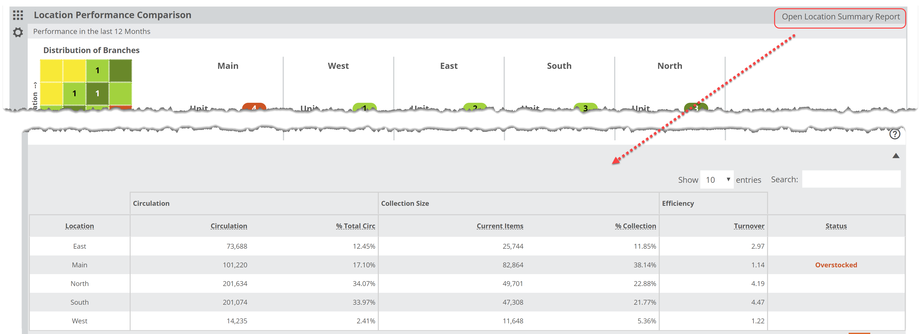
Click Open Location Summary Report in the upper right of the Location Performance Comparison lane to see details about the relative performance of each of your branches:
You’ll be able to see, based on the timeframe you selected and any Saved Filters you’ve set, details about the Circulation, Collection Size and Annual Turnover at each location. Let’s look at each section:
Location:
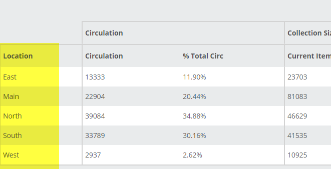
Each branch should be listed. If not, contact support@abovethetreeline.com and we can investigate.
Circulation:
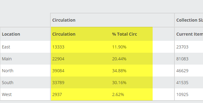
Within the selected filters, how many total copies circulated at each branch? You’ll see that number in the Circulation column. %Total Circ shows the percentage of your TOTAL circulations represented by each branch. In the image above, the West branch accounts for just 2.62% of the total circulation, while the North branch accounts for almost 35%.
Collection Size:
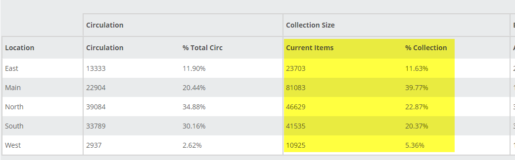
The Current Items column indicates the total number of items currently owned (again, within the confines of any filters you’ve set) at each of your branches. % Collection indicates the percentage of your total collection for which each branch is responsible. The West branch accounts for just over 5% of the total collection, while the hefty Main branch accounts for almost 40% of the total collection (but just over 20% of the total circulation).
Efficiency:
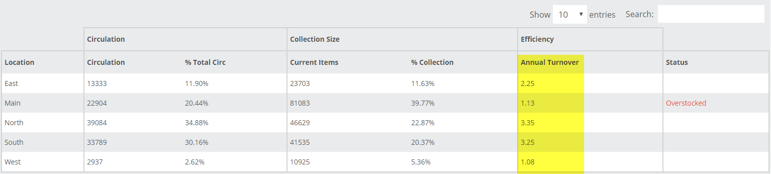
Annual Turnover indicates the number derived from the Circulation versus Holdings equation. You may have a target turn number in mind, but remember that the higher the number the better, for the most part. The North and South branches are looking pretty great in the image above.
The Status column indicates if a branch is clearly over-or-understocked. Essentially, if the Collection Size greatly outstrips the Circulation numbers, it might benefit from some weeding, and vice-versa.